The Digital Studio
CMD+Z: Infinite Possibilities
The Digital Studio is an introductory course that aims to teach students the methodologies for creative expression using digital applications in photography, drawing, moving image and the web. Throughout the course, students will develop their literacy in Adobe Photoshop, Illustrator, and Premiere, as well as learn coding for the web using HTML/CSS.
The class focuses on creative visual problem-solving and image-making skills, which can be applied across many disciplines such as creative arts, computer science, geography, and others. Students will produce multiple smaller assignments throughout the course, each of which will culminate in a final creative project that engages personal expression and contemporary visual culture.
Overall, the course provides a solid foundation in digital art and design, with an emphasis on both technical proficiency and creative expression. By the end of the course, students will have developed a range of skills that they can use to create innovative and visually compelling works of art and design.
Design Principles
Translating From Pencil to Screen
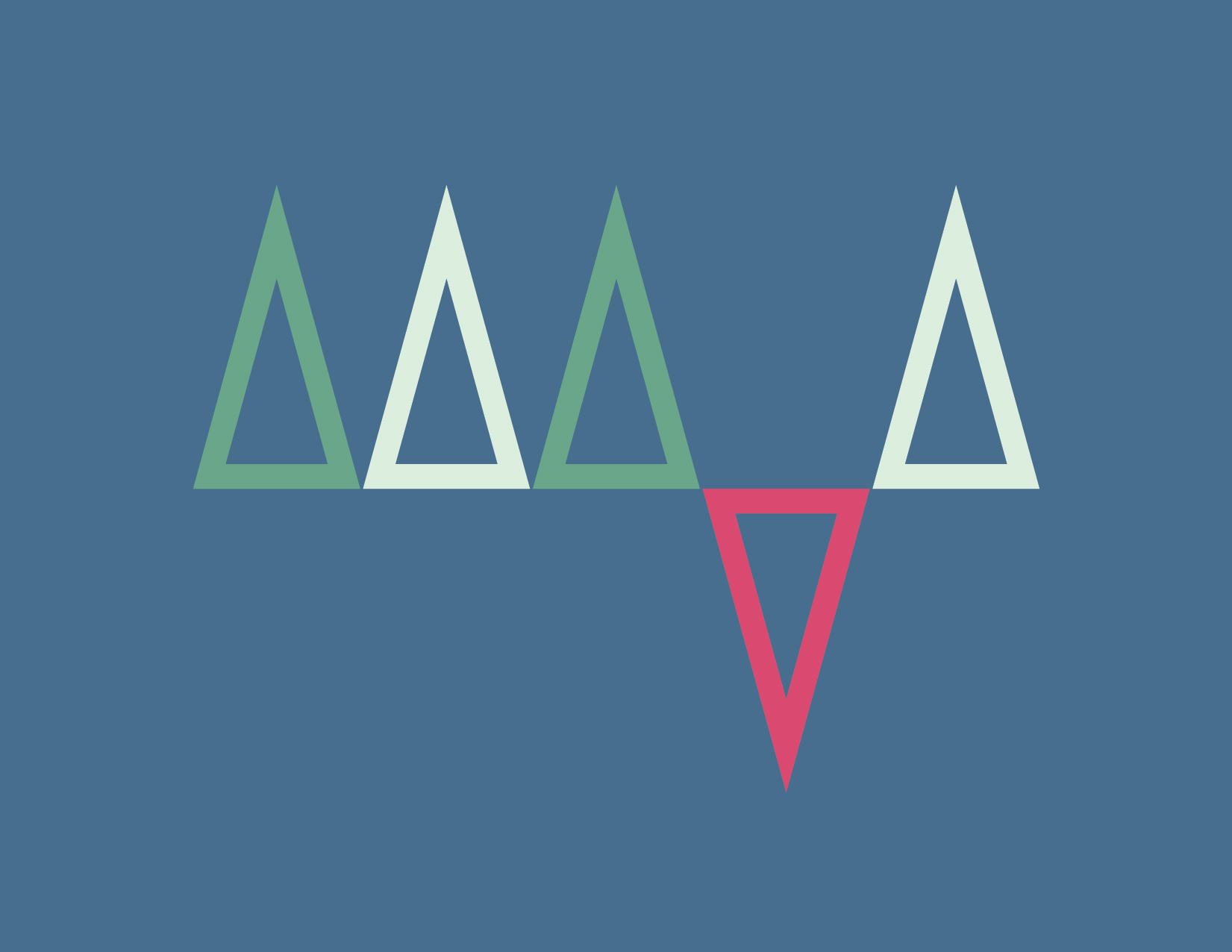
We explored the core design principles of unity, balance, dominance, contrast, proportion, and rhythm. Throughout the course, we delved into the core design principles of unity, balance, dominance, contrast, proportion, and rhythm. Unity is the idea of creating a cohesive whole, where all elements of a piece work together in harmony. Balance is the distribution of visual weight in a composition, achieved through the use of symmetry or asymmetry. Dominance is the emphasis of one or more elements in a piece, creating a focal point or hierarchy of importance. Contrast is the juxtaposition of different elements, such as light and dark, to create visual interest and depth. Proportion is the relationship between different elements in a composition, where the size of each element is considered in relation to the whole. Finally, rhythm is the repetition of elements in a composition, creating a sense of movement or flow. We explored each of these principles through black and white compositions and were limited to using basic shapes.


Adding Color
Exploring Palettes
We explored the following color palettes: analogous, complementary, split-complementary, monochromatic, triadic, and palette generated from an image.


Gradients
Using only flat shapes, colors and gradients, create a composition that gives a sense of three-dimensional space

Experimentation in Type
Exercise 1
I created logotypes for the words "tension" and "woosh". They were created using a typeface.


Exercise 2
For the second type exercise, I chose the words tea and coffee. Then I created a composition where I depicted your preference. We were able to use all available techniques such as color, typeface, type styles, distortions, 3D effects, and patterns.
The words did not need to be logotypes or even have their meaning illustrated. Can you tell my preference?

Digital Collage
Introduction to Photoshop
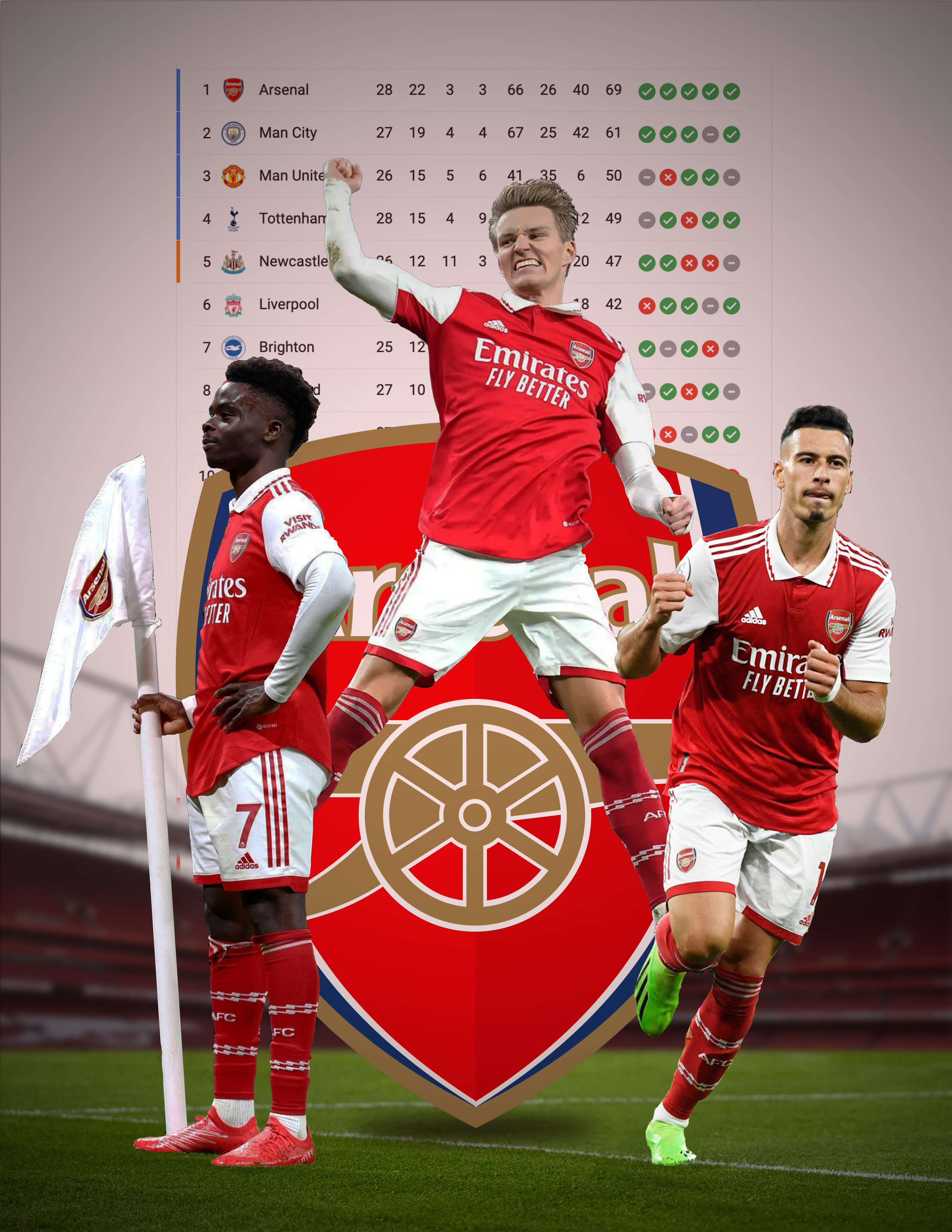
I created a digital collage on the topic of your choice. I created a graphic of a soccer team I support, Arsenal. In the composition I payed special attention to palette, high craft standards, background the white space created by collaged elements.
Sol Lewitt
New Directions Project X Sol Lewitt Digital Drawing
Inspired by the work of Sol Lewitt we cerated a square composition following a set of rule. The dimensions of the illustrator file were 1920px X 1080px, RGB color space, 300dpi. The initial square was 900px X 900px . All should occur in the square unless specified.
2) Color one half square blue.
3) Color one half square orange.
4) Make a gradient section.
5) Make a striped square.
6) Make a fat stroke square.
7) Make a skinny stroke square.
8) Make pattern in one section.
9) Color a quarter square with a dark color.
10) Color a quarter square with a light color.
11) Color an orange triangle.
12) Make two sections that intersect.
13) Make a section that is red and yellow striped.
14) Outline a section with black.
15) Outline a section with red.
16) Mirror a section.
17) Make another patterned section.
18) Make one element that breaks the border of the square.
19) Make one square that has a Blending Mode other than Normal.

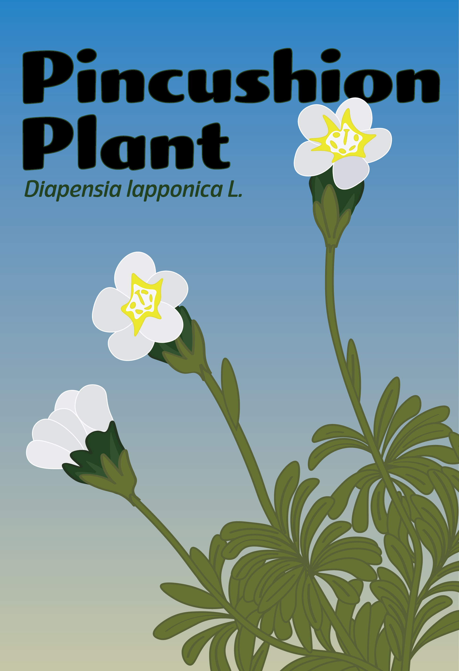
Botanical Illustrations
Diapensia lapponica ssp. Lapponica aka Diapensia
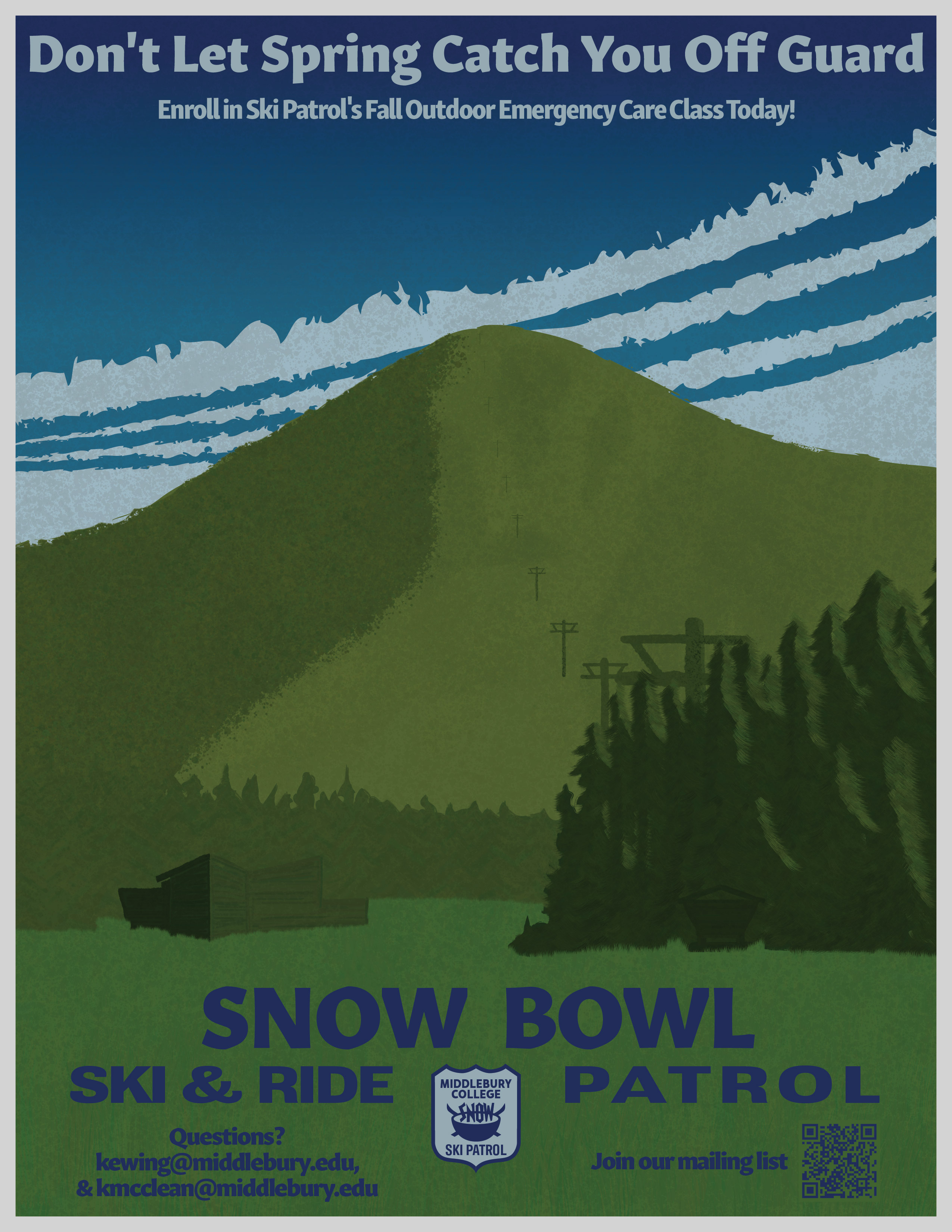
Final Poster
Call to Action Poster.
As the president of ski patrol and with low attendance in this past fall's outdoor emergency care class, I knew I wanted to make an advertisement for the class as my final poster. I took inspiration from the Ranger Naturalist Service posters from the early 1930s and 40s.